Monday 29 June 2009

Mini Comic


Whilst working on a re-work of toastieo and the BMI entry I've been playing around with doing a some short strips in a day, here's an example of one I finished a couple of days ago.

(Edited Title) Ink Soup 4 front cover


Hand drawn title this time, with some clouds to give it place- also the 4 is there as well. The new adjoining back cover will be up this week.

Just sketches that will become more later


Wednesday 24 June 2009

Any news?

Hey guys...it s summer and i m awfully boored here..has anyone got anything news or new stuff for inksoup to share??

Saturday 20 June 2009

Godman

I redid the middle panels. Hopefully the facial expressions are a little more clear now.

Wednesday 17 June 2009


hey everyone. me again i have completed my submision now after contrast editing etc etc i planned the final page, and am happy with it. :) the pages are in order teheh i know i should really keep on working on how to make this better, but i feel its finnished and am going to move onto editing my two page comic. the last image is just an example of how i planned out the final image via some of the thumbnails

To Progress or not to?

"and its changed considerably since you started the first drafts 8D" a quote that I picked up from Cherry that really says how one should be looking and developing their own work!

O f stuff posted so far, there are three categories:

acceptable as is: Roo's work

acceptable but could do with refining: Godman (and other peoples work)

unacceptable: what's left

Why have I cryptically written "other people's work" and "what's left"

Because like Murray, I feel it extremely awkward and painful to have to comment about work that people should be analyzing and changing themselves, before rushing to post up! Unless they are willing to make substantial modifications as in the Niovi.

It doesn't mean it's always getting better, but it does mean that that person is really exploring the visual possibilities!

Almost there..


the originals and the edited ones.. i ve already scanned the first 2 but the last one i finished it last night and i wont be able to scan and work on it till thursday.
i tried to darken the frames so the backround is less busy but i think that something s still wrong...
any comments bout it?
thnx :)

stupid question no?

i was just wondering how cool it would be to make an ink soup color addition next year? are there any chances of this even if we chip in some cash each?
i dont know if this has already been considered or not? but jus thought id put the idea on.

Flying Mushrooms and Rabbits =D

Ammended text- hopefully this looks better, it looks more graphic-novel-like now i think.

Tuesday 16 June 2009

Back Cover


Milan's already noted that the type looks too clinical in this picture and suggested drawing the type? I can't make my mind up with the back cover to whether if it needs to be revised completely or only slightly? I can't decide if it's the drawing itself which is weak or if it's the composition? Like the front cover, the sky needs detail added! Thanks! ...bit of an onslaught tonight!

Toastie-O Pages 1-3


Slightly edited pages 1 and 2 with new fonts in place of the old favourite cooper blk! Plus page 3, page 4 will be up tomorrow when I scan it in. It won't be the end of the story as with the experimental side of this ink soup I'm contemplating making the story arc over another 2 pages, but you'll have to wait til tomorrow to see what I mean (suspense!). In terms of what I've already concluded, after looking at Luke Kennedy's work I think I need more stark contrasts, also drawings in some panels aren't as consistently strong, but I'm happy with the story as it stands. These are my feelings, so was hoping people would like to confer with their own, I know chiu will have plenty to say, but please be as honest as you like, even if to say re-draw it all!

Ink Soup 4 Front Cover


Front Cover to the new Ink Soup- the back cover should hopefully be up tonight if I find myself happy with it, but in the mean time feel free to rip this apart first :D

Flying Mushrooms and Rabbits- with text!!

Hopefully final pages for ink soup- the type i used is lucinda sans, i wanted it to look robotic, like a computer screen text documenting what was going on. I wanted it to look a bit like what you see at the start of films, with the text running across a computer screen, i wanted it to look a bit weird and out of place, but as though it stands out, i quite like the effect .I know the title is on the opposite page, but i think this looks ok, any comments welcome.


Monday 15 June 2009

How to send ink soup work ??

Just wondering how to send the work for ink soup and who to??
what kind of file size and format
thanks.

Sunday 14 June 2009

Godman from Luke Kennedy

Godman is a submission from Luke Kennedy, hopefully an incoming degree student. More of Godman can be found & downloaded for free here:
http://www.lulu.com/content/paperback-book/godman-2008-annual/4628020

Dream - from RoO

Here are two pages for crash and burn from RoO! Truely inspirational!


Thursday 11 June 2009

the crash and burn experiment

lets make crash and burn the really experimental issue!

obviously you are restricted to the A4 page format, but if you wish to cross it for an A3 spread; make narrow panels like cherry; make strange nonsensical sequences; go portrait or landscape; Longer stories also accepted! - BUT WE STILL EDIT ON QUALITY!! First quality control this Wednesday - I will start putting the pages that get in into indesign!

cheers,

the evil onion


i realised i have to focus on how to make my work better instead of handing out final images on a plate. so i have done some more versions. i kinda like em all , i dunu which ones to include. any opinions. i know what the sequence is going to be though :)

Wednesday 10 June 2009


Hey guys me again
since its 4 pages each can i submit a two page illustration thingie.
:) i know i left the bottles purple on the second image. i forgot to convert them Duh me. lol the story in it is pretty obvious.
but i guess it dosnt matter since it prints black and white anyways.

One last try..?


heh

I know I put as a target to finish this by tomo but us usual I m not done..anw no hurries this time :)

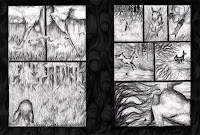
This is the 1st spread of the new interpretation of Oh Deer! and it s going to be 3 spreads afterall (hope that’s ok..)

The frames round are considered to be the bleed that’s why I made them pretty thick (2cm). The trees in the middle actually i had that idea since I started my picture book bt never had the time to test/draw so they were left as just an idea and now I finally found an excuse to test whether that would work as a frame or not..something I haven’t decided yet..mbe they are too overwhelming and shade the story which is what actually matters..?

Anw..as I said this is the 1st finished spread..these are the rest, they re just rough outlines but it gives a general idea of how the story will be. I thought of posting them before proceeding to “colouring” (which takes aages to do) to get opinions on the panels. I drew n re-drew over till I got mainly the frames ok but if anyone has an opinion about them for getting them better please tell me...(preferably before I start working on them!).. (um from the roughs the last one is suposed to be first and the rest are at the right order..)

Thnx

niovi


P.S. they are a/3 so i had to take a photo of them so forgive the not-so-great quality of these pics..i ll scan it tomo when i going in..


Monday 8 June 2009


here today, gone tomorrow, for ink soup 4, it was a last minute decision for me to submit for it, and i did it all in one night! phew ahah
i painted it all straight into photoshop via tablet with my steady hand. :)
it was great for solid inked lines. and so very fun. drawing it digitaly straight into PS was a huge advantage for me, i could work over drawings until i felt it worked right. and i could zoom riight in to get to some nitty drawing details.
and yes chui that IS you. and that IS me rearranging your face. it seemed to fit well. its a response for calling me dim-witted :) well. any suggestions on how it could be changed. i think i like the overall compositions, but i feel the second page separates itself from page one in terms of style. but i think i just get away with it


Ive got two different tonal versions for my two page ink soup
just wondered what people think????

still need to add text when i get my sketchbooks back =)
comments welcome, thanks guys

Thursday 4 June 2009

Ink Soup 4

Hey everyone, it's all been a bit quiet on the Ink Soup front so thought I'd check to see who's planning to enter work in for the next issue (if any?). Thought it would be good to be organised and stress the ideal deadline of next wednesday? If you are, could you also give an estimate of how many pages you're planning to enter? If L6 want too it would be wicked, but understandbly probably want to avoid anything that looks remotely like a pencil/pen for a while? L5 we have to work out who's going to replace Debbie and Jess as Contents editor and proof reader?

Cheers :D

Professor Quib "Re-Drawn"


Re-drawn my one off page Professor Quib, I prefer this version,currently working on a coloured version, experimenting with a palette? Hmm! let me know what you think?

Toastie-O Pages 1 & 2


Toastie-O is my new entry for the next ink soup. I'm planning to add colour, but obviously leaving black and white for ink soup. There's 5 pages in this story as I'm directing my comics to general comic submission guidelines (minimum 5 page sequential art). Also a bold move moving from my handwriting to a recognised font, can't make the final decision to whether it works or not? Let me know what ya think! (Dont't be shy, I've handed out a lot of criticism so lay it on me)