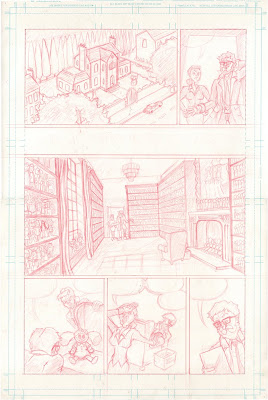
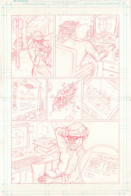
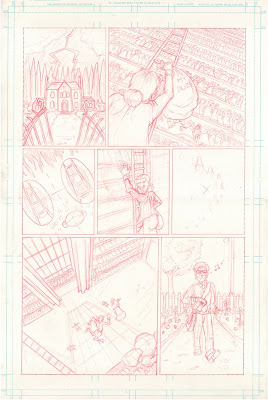
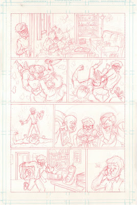
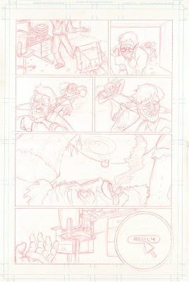
The script for this came from the 2000AD competition at thoughtbubble festival, Unfortunately I didn't make it to the event...as I am only on pencils anyway.
Not very happy with my hands throughout so I plan to work them up again. There are a few other bits I am not happy with but would be grateful for some feedback :)
Tim

1 comment:
Looks nice, particularly like page 1, 3rd panel.
7th Panel on page 4 I think is the weakest; unless i'm reading it wrong, his forearm looks far too long, and in terms of continuity; his sleeves aren't rolled up there, whereas they are in the preceeding and proceeding panels.
1st Panel on page 5 aswell, it could be that there's not much incinuation of foreshortening, but the legs look a little unnatural.
Post a Comment