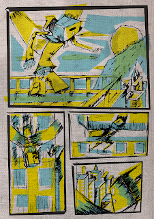
Just thought I should post somthing, I get alot of mixed feelings about this piece, don't know if I should like where it's heading...It is just experimentation anyway, just thought 1+1=? you know...Was sort of going with a Screen print look, with some over lapping colours, I think the line work though brings it down a little, some lines didn't translate into vectors too well.
Might push it further...

1 comment:
the screen print effect is nice but i would take more time thinking about where/ how you are using colour and the negative space you are leaving. It is currently making the image less clear, whereas colour should add another layer of definition and clarity. you mentioned some of your lines did not translate to vector as well as hoped so maybe this is also contributing.
Post a Comment