Saturday, 31 October 2009

Bald Cypress redrawn page 1 of 2


Redrawn bald cypress, a previous comic, I liked the story but had rushed the ending so re formatted it over 2 pages and will be included in the anthology I'm working on- only first page atm, let me know what ya think!

Friday, 30 October 2009

Latest INK SOUP 04 Update

The InDesign document is very nearly complete:

Ed Homer 6 pages
Murray Somerville 5 pages
Krystian Garstkowiak 2 pages
Roo 2 pages
Wan Tsz Ting 2 pages
Chiu Kwong Man 8 pages
two black back of poster pages
Katie Coulton(poster 2 pages)
Jess Watson 4 pages
Alex Hovey, Daisy Whitehouse and Tom Bishop 1 page
Karen Bryers 1 page
Tom Chippendale 3 pages
Toby Walsh 1 page

03 pages left! 1 single + 1 double spread (separate from each other)
I need a single page story + a two page story! or three single page stories


Dan Griffin-Hayes Rise of the supermarkets!!! CAN YOU FINISH THIS PLEASE!!!! IT's 90 percent done?

One page!! Or will someone submit before?? WE GO TO PRINT FOR FINAL THIS TUESDAY!

(note, Toby Walsh, Tom Chippendale - you need to tidy up your own work next time before submitting, but it's been done for you this time :)


this is the first page of a story I've based on sample from a song, but i can't find who wrote it originally. not sure if this counts as plagiarism if i use the lyrics in the novel. these are the lyrics to go with the illustrations any way :

A change of heart, a change of plan must surely be the way. Get off the
ground - you're heaven-bound! And if you like it when you're there you'll be
allowed to stay.
"This is the way it has to be", the wisemen wisely said. So we believed, but
some did not. And though we never knew, the wisemen, wisely had them shot.

Tuesday, 27 October 2009

Fumetto Competition

Comix Competition
YOU+ME=US

The competition’s theme this year is You+Me=Us.- Between You and Me there‘s a difference, but a lot of things connect Us, both of Us live here. Especially in a globalised world cultural diversity needs to be perceived as an opportunity. This can only be achieved if as many people as possible from different parts of the world develop an understanding for each other and foreign cultures.

The Mercator Foundation Switzerland is committed to breaking down social barriers and enabling mutual respect and tolerance.

more details here

Angoulême, Comics, YOUNG TALENT CONTEST 2010

The International Comics Festival organize for the 9th year in a row in association with the Caisse d'Epargne, the Poitou-Charentes region and Magelis, an international contest named "Young Talents".

This contest is free of charge and opened to comic strip writers, aged of at least 17 years and have never published professionally.
The participants must create a full comic strip story complete with title, with or without text, with one, two or three original story boards (printed versions are accepted as originals) in black and white or colour. There is no imposed theme.

French (vertical form) A3 size paper is compulsory (29,7 x 42 cm maximum).

Please write your name, first name, address and telephone number on the back of each sheet. Enclose a cv and photocopies of the work in a press book / portfolio type document e.t.c...

Post all documents flat (not rolled up in a tube) before Novembre 13th, 2009 at the following address :


9ème ART + / Festival International de la Bande Dessinée
Prix “Jeunes Talents”
71, rue Hergé
16 000 ANGOULEME

full details here

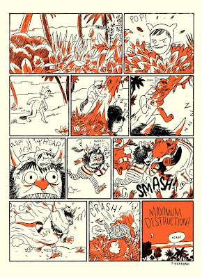
24 artists inspired by Where the Wild Things Are


which includes a short graphic story by Sammy Harkam (above)
more here: http://wherethewildthingsare.viceland.com/

Journey Details for Comica Comiket: Small Press Fair 2009

Outward - Sunday 8th November 2009
08:43
Birmingham Moor Street

Return - Sunday 8th November 2009
22:00
London Marylebone

Doors open at the ICA at 12 for 1 hour set up

public 1 to 6 pm

Ive made a start on the next novel and **** is it taken ages!!! Think this one is going to be 6 pages (3 panels to a page) with a full page spread thrown in as well. Anyway this is what ive done so far - they're not in order and the panel with the missing snow globe is obvs unfinished. Let me know what you think

Sunday, 25 October 2009

Friday, 23 October 2009

Festival-of-masks-this-monday-26th


Monday has been pronounced Festival of Masks - a SHOW & SHARE fun day making masks

Here's the deal: You have to bring in material to make two masks, one for yourself, and one for another person. You also need to know how you will make that mask, do some research if you're not sure, but it is meant to be fun, so keep it simple, and you don't want to give yourself a headache!

We can descend on the pub if it's finished by two!

very best,
chiu

Night At The Fair (New Layout)


Ok i've changed the layout which I think works so much better than previously, and it's closer to Thomas Ott's layout style who's heavily influenced me. Let me know what you think - will come in tues morn to hand in!

Thursday, 22 October 2009

Diver.


A3 pencil comic scanned and edited. Let me know what you think...

INK SOUP 04

I'm coming in tomorrow morning to re-scan my pages and try to sort the layout again - I know ed is working on his, Murray will have his, Jess is confirmed - I need to get Roo's and Tsz's again, as I may have mislaid them duh!

Karen, Vicky, Niovi, Toby, slappy monkey, Danup1, and anyone else I've missed out, send in your Hi-Res scans please via yousendit to my bcu address - NOT Guaranteed entry into INK SOUP
Cherry, are you still doing yours?

Milan? Contents page?

Katie Coulton, can you scan it in at 600 dpi and send it to me again, as we may use yours as a poster page!

By next week Tuesday I would like to TEST PRINT!

Best Chiu

some other people may be submitting soon, Debbie Lambert, Toby Pennington hopefully, so let's see?

Hansel & Gretel


Hey there! This is an improved version of my hansel and gretel story (with straight panels :-P). I still need to apply text and do some finishing touches, but I will be doing that today. Is there any room for this story in Inksoup possibly? :-/

Wednesday, 21 October 2009

one of my comparative references


This is my first comparative reference in terms of graphic detail, panel to panel transitions, composition and effective storys by Frnak Miller. Sin city the hard goodbye to me represents the direction i wish to aim for. It's inspiring to me because of how effective the black and white boosts the story, also the manipulative aspects to the panel transitions and how engaging the visuals are in this style. more in my sketch book pz

Debt


Based on a story I wrote at the beginning of term.

Jaws Project


I hate my scanner as half the shades look crap and from the scans I prefer the original.

New story for Xmas (untitled)


Ok this is pretty much a re-hash of my Lost Toys story but with a festive twist!

It doesn't come across to well in these images but the polar bear lights up in the globe and appears in the bedroom - and glows at the end to return to it! Have tried to avoid using too much symmetry which I think works well with the open landscapes.

Influences for this were The Snowman, Polar Express and The Golden Compass. Currently collecting a load of images (visual references) of polar bears and snowy scenes while experimenting with making snow in photoshop!

Let me know what you think, thanks

Tuesday, 20 October 2009

Blow My Circuits


My latest comic finished and with the writing re-worked, its not a complete changeover but I channeled alot personality and humour into it so the writing either enhances or is ironic to the imagery attached- let me know what ya think!

Ashley Woods artist of interest


Just a little example of the sort of comic book/Graphic novel work Ashley Woods produces.I love the rough feeling in his work along with exciting panel transitions.


Uncompleted Rise of the Supermarket!!!


So I personified a supermarket to highlight the problems they bring to communities. That is the basis of my story and I thought it was strong enough idea so i just made it up as I went along. This did create some problems and in future I'll try and plan stuff out better. I haven't put any text in yet and its missing a few pages.

Monday, 19 October 2009

Visual references.


Robert Valley's angular style inspires me to experiment with perspective and foreshortening. More on his website and blog.

how the elephant got his trunk


Hey
This is a short story I working on to build on my narrative and style. I looked at aboriginal rock art and they visual language. below is an image from the Wandjina tribe that inspired me alot. I need to redo the text on the computer, but apart from that I'm pleased with the result, your thoughts please.

Inspiration From David Mack


LOL! Yeah I know, it was just a drawing I was doing while watching TV to be honest :-P But I appreciate the character interaction comment :-) The pictures above are examples of David Mack's work for graphic novels. He uses a mixture of panel sizes and he always plays with the placement of his images. I love that his work is different and not your standard square/rectangular panels - his pages to me are visual interesting/intriguing and have a richness to them. This inspires me to experiment with layouts in my own work.

Sunday, 18 October 2009

Random Drawing - Possibilities?


Again just a digital picture, but this is a bit of random drawing I did in my sketchbook. The top image is actually my take on a piture I was inspired by that I found in a magazine. But I would really like to take this further and create a short story for this...

Saturday, 17 October 2009

The comica Festival 8th November London ICA


Here's some simple initial information on how the Comica Comiket
Small Press Fair will work this year. Hope to see you again!

1. Date: Sunday November 8th 2009, 1-6pm (might extend a bit later tbc)

http://www.comicafestival.com/index.php/festival/festival_detail/comica_comiket1/

okay people! This is a big one for us. I have asked for a half a table for ink soupers the anthology (there will be four) and for individual comics! Start printing!! Acceptance is on quality of design &/or content!

Friday, 16 October 2009

nooo I need protein re-drawn & re-drawn

Re-drawing single images from a series made much earlier on can be quite tricky - in this page I found it difficult to remain within the flavour of the original "hemorrhoids" pictures and have had to draw & re-draw:

Thursday, 15 October 2009

A Fractured Common Tale - Hansel & Gretel

Hey there everyone :-)
I picked "Hansel & Gretal" for my fractured common tale, where the two kids are the baddies and the old woman living in the candy house is the victim. The parents of Hansel & Gretel decide to get rid of them ( :-P ) because they are so bad they cannot stand them anymore. Eventually, Hansel & Gretel find a house made of candy and because they are so greedy they start to eat it, without any regard of whose house it is. The old woman who lives in the house is shocked and upset and in the end they get busted! This is a simple digital photograph and not a final version. I would like to produce another improved version and possibly to explore different mediums, looks and feels. Furthermore, I need to apply some form of text!
- Karen

Wednesday, 14 October 2009

Night At The Fair


Hey guys

this is the finished version of 'The Fair' story. Sadly there isn't any time to make any adjustments for the Observer Comp as the deadline is mon and it'll be in the post tomorrow, but production of the next ink soup is still a couple of weeks or so away i believe. It was originally 5 pages but I edited it down to 4 for the purposes of ink soup and the observer comp.
anyway let me know what you think, thanks

Tuesday, 13 October 2009

mini stories

Heya,

Murray mentioned that his story was five pages long and that we needed an single page to fill the space. I did this rough in my sketchbook last week and then thought that with some polish it could fit. The idea is that the are 4 "mini stories" taking place in 4 stories of a house, all affecting eachother through the walls/panels. I would change the stories themselves to make them a bit more interesting, but how is it as a concept?


ps. This is rough and obviously not the finished look, I did 2 sample panels to show how it might look finished (not colour though of course)

Thanks,
Kt.

Post your work or DIE (my L5)!


Post your work & visual references (make sure you say why you are posting this reference), or die! Said the crazed onionman!

here's one of me references (image above):
Marko Turunen

The bright contrasting colours inspire me to produce some short sequences for silk screen printing - not necessarily full narratives, but just excerpts

Monday, 12 October 2009

Ink-Soup4 Cover- first draft


Hello everyone, I've put together the cover as far as i can at the moment to see what people think and point out what they think needs re-working or looking at, as I've been looking at it too long I need a little bit of outside opinion! :D cheers

Sunday, 11 October 2009

Crash and Bird


A simple thingy maybe its too simple ? ... ha ha

Thursday, 1 October 2009

Ink Soup 4

Hey guys, just trying to organise ink soup 4:

So the deadline is the 13th of October looking for a possible print that week, so just under 2 weeks left, but also if work can be uploaded as you go so it makes the editing process a lot easier!

We need to know how many people are hoping to submit and how many pages they have, from the top of my head I know we have :

Myself (5pages)
Ed (4pages)
Jess (4pages)
Chiu (4pages)
Cherry
Roo
Tsz
Godman(?)
Niovi (4pages)

So if you are thinking of submitting then post up and let us know!

The other big thing is we need someone to volunteer to take on the contents pages- so if you're interested please step up!

If there's anything else people want to bring up or something I've got wrong feel free to say :P

cheers,

Murray