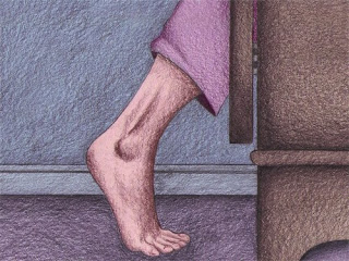
I've been messing around on photoshop with some of my pencil drawings trying to add some colour!!! These two images are my 1st attempt at it and to be honest I don't think they're working very well - in terms of both images looking as if they belong together (tone, vibrancy etc).
Im not very computer literat and struggle at the best of times so if anyones got any suggestions for improvement I'm all ears!!!


1 comment:
hey,
i think they re really good both images. i like how you blended the texture with the colour very nicely.
for the colour consistency...well in terms of colour i think you over coloured a bit your blue monster and the pencil work and texture is kinda lost..
q: did you do the colouring on the same layer with the original work or different?
if you did it on different layer try to drop the opacity down to 80%. This will make the colours more pale and more consistent with the other image without needing to do much of anything else..
Post a Comment