Friday, 14 October 2011

Beauty And The Beast


Made some changes which was discussed on Monday, like detail, panelling in page4 and added the text. I liked how it was obscur with 'him' and 'her' rather than names, dont hate me Tim.

Monday, 10 October 2011

Top Cow Submissions.

Okay I was particularly curious concerning this, so I'll throw it out there in case anybody else is wondering, or can shed some light on it. Top Cow are a publishing company, who helpfully have put submission guidelines on their website concerning Scripters, Pencillers, Inkers and Colourers.

For Pencilers or Complete Artists:
Quick tips:
1.    Backgrounds are as important as dynamic figures! If you send us some great pinup work but either not enough or bland backgrounds you will most likely get filed in the trash. Give us a showcase of all your skills.
2.    Use a variety of camera angles, depths of shots, and shot selections on each page. The easiest way for an editor to spot a novice penciler is medium shot after medium shot. Your pages don’t just have to be competent, they have to be exciting!
3.    Your first job is to tell the story. Is your story-telling clear and easy to understand even without the dialogue?
4.    Hands and feet. Editors look at characters’ hands and feet.


For Inkers:
Quick tips:
1.    Be true to the artist’s intent. Your job is to strengthen and enhance the penciler’s work, not over-ride it with your own intent. Make sure you understand what the artist is trying to convey (shape, shadow, texture) with every line.
2.    Separate forms and create depth by using varying line thickness, breaking up lines, and different rendering techniques. This is one of the inker’s primary jobs.
3.    The tool you use to ink is not important, but use the right tool for the job. Classic tools like nibs and brushes rarely fail in a skilled hand. Typically, technical pens and markers will not give your line the life it needs to enhance the original pencils. Digital inking is an emerging discipline, but remember that computers are no substitute for technique.
4.    Vary your technique to convey texture. Metal should not be rendered with the same technique as fur or wood for example.

They're pretty handy things to keep in mind I think, especially considering those are the expectations they have for if they're going to pay you...

What was of particular interest however, was:
For sample pages of Top Cow characters to ink download the images from the following links. Right-click these links and choose “Save target as…” for high resolution 300dpi JPGs. For best results, it is recommended you print these samples in non-photo blue ink on comic book art stock board (ex. Blue Line Pro).
The paper is here: Comic Board from Blue Line Pro . This board's 11x17 with a 10x15 working area, which means they want the pencils printed onto this, which at the time left me wondering: does anyone know if printers can have different calibrations and be formatted to print to different sizes? On CS5, with my crappy desktop printer, there's no option for printing at 11x17, even though it does fit in my printer.

Even if noone knows, it's good to be aware that at sometime in the future we may be required to do this, (if you decide to go into 'mainstream' comics) and knowing how could well be of use!

Tuesday, 4 October 2011

Newz

Hello you inky buggers.

I've made an Ink Soup facebook page so add it and let's build up some support! Also I intend to post some work from previous issues on the page (is that allowed Chiu or do I need permission...?) so please let me know if you don't want me to - this would only be finished pieces from actual issues for now.

tata


Wednesday, 28 September 2011

Tuesday, 27 September 2011

Last bit of lettering...

Morning people! After the meeting yesterday, and due to the deadline for submissions, I'm looking at lettering my beauty and the beast pages before getting too stuck into writing scripts. What would be helpful would be some opinions on said lettering, I've tried digital fonts, calligraphy nibs and brushes. I know which I prefer, i'd just like some other input before going ahead on the final pieces.

This is the digital lettering, the font being an edited open source typeface found on the internet. 

Calligraphy Nibs. I followed http://www.blambot.com/handlettering.shtml This tutorial thing on filing down a nib I didn't often use. It does give the letters a nice quality.

Finally brushes. Apart from the 'o' in Know, the freedom of weighting of a brush led to a nice mix of formality found in the calligraphy nibs, and the rather artificial looking digital type.

Monday, 26 September 2011

NEXT ISSUE OF INK SOUP

'sup. Anyone who wants to submit something for the next Ink Soup please send me an email at peetoman@blueyonder.co.uk (and ideally let me know how many pages)

Provisional submission deadline: Monday 10th October

ULTIMATE DEADLINE: MONDAY 17TH OCTOBER

cheeeeers

Monday, 19 September 2011

Beauty & Beast page 3

So, this has taken a long time and there's not much left, BUT the third page is done! I'm already working on the last two. And I've learned to draw boats.

Also, I've started working on something new, only a few pages, and still at storyboard level. I °might° enter it into the Observer competition, though first of all I just want to lay it out and use a bit of watercolours, for fun. Next step is photo references. I'm also trying to make my storyboards a little more comprehensible and closer to what the final image should look like, at least even if something stays at the first stage I can go back to it later and actually understand what I had in mind.

Monday, 12 September 2011

great find by Tim Ki-Kydd:
http://timebombcomics.blogspot.com/

Some of you may be interested submitting work?
http://timebombcomics.com/submissions.html

Saturday, 10 September 2011

Button Phobia/ Zipper Phobia


These  are the pages about Button Phobia and Zipper Phobia. the first picture is about how the Button Phobia woman reached for sweets that were on a pile of button boxes. dramaticly they fell on her and she was forever traumatised.


The Zipper Phobia guy developed his fear during a  camping trip. When he was about to lay down ad opened his tent an angry racoon attacked him. Ever since he wont open any zippers. 

Below you see the sketch for the layout. I'm ok with it but need to check on size and better perspective. For example the way the Butto Phobia girl reaches for sweets.  She could be way more in bird's eye perspective (hand much bigger than her head). and the lid of the candy glas could be slighty open so you can see some lollipops. My next step is to redraw both childhood storys and of course think about the final page how they get together. I could use some feedback on this please. 

Thursday, 8 September 2011

Have a look at

Comical Animal

Wednesday, 7 September 2011

late research?

http://whatson.visitbirmingham.com/birmingham-royal-ballet-beauty-and-the-beast-746100016

Though I'm not sure how I feel about ballet, what are the chances that it's on? :)

Competition

05 Warsaw Rising Graphic Story Competition deadline 03.10.2011

Thursday, 1 September 2011

Beauty and thew Beast thumbnail layout development

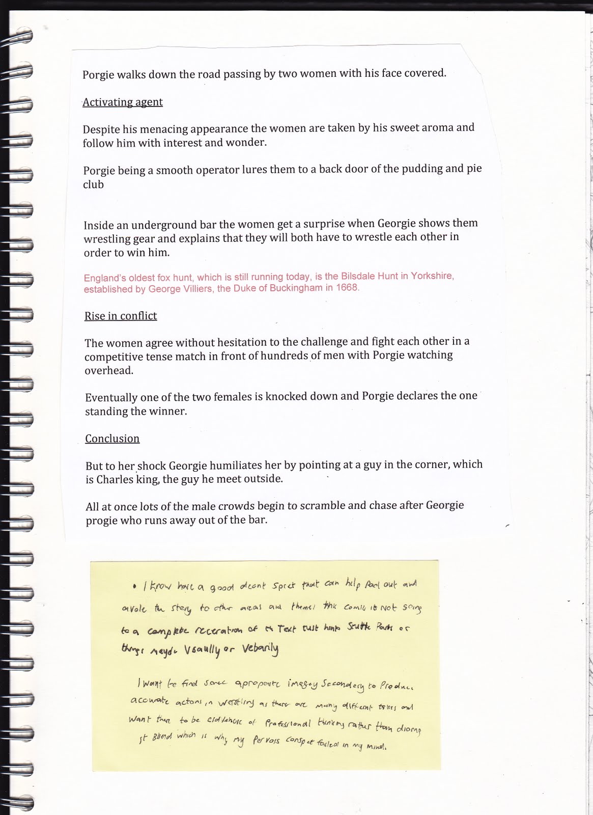
I have tried to give much more depth to my fractured Georgie Porgie in my story RVJ. By looking deeper in to the character of the duke of Buckingham (who was Georgie in the rhythm) and his relationship with king Charles the 2nd and discover why all the girls cried. I find some useful information in to these two characters


The script for the story with 
pieces of text proving my point on 
Georges sexually.  


From now on I am using secondary and primary photos and images to aid in a stronger execution.


rough thumbnails


Final roughs 

Visually the comic will look like what i showed on my  pervious post on visual direction of the work. 


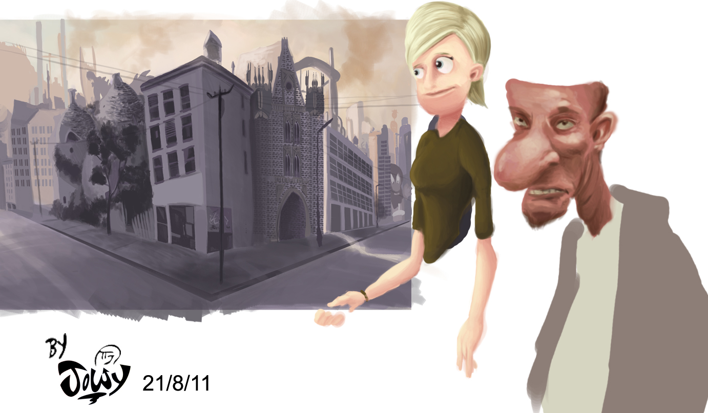
My final finish will be digitally coloured on PS seeing as that’s a media I am much more familiar and I believe i can be creative on. I did a quick colour test on page 1 to see how and what sort of atmosphere and style of digital painting the final will be.

I am hunting currently for other digital artists who expand Photoshop and tablet software to new heights to produce sharper imagery. Learn their techniques to make this much more enjoyable and experimental.

personally i think this could help in my ambitious
idea. 


Josh  


Wednesday, 31 August 2011

visual project concept and Colour tests


It’s been a while since I posted any work relating to my developing negotiated project partly because of the size of the idea and scale of research.


I essentially want to produce a comic that combines a roger Rabbit, Cool world vibe. Where reality and cartoons meet but my universe would be visually unique, animated, surreal, and geeky, while maintaining a sense of real life culture and people its quite ambitious to be honest.
.


Cool world had such a haunting creepy atmosphere that works for its crazy cartoonly inhabitants sort of like Tex Averys work. Almost each animated back drop has a hidden face and twisted sky scrapper in it which 
Inspires me in the architecture aspect of the project. 


The idea of cartoons and reality blending together in a separate society really seems like an interesting angle to go with my developing practice could make for great comics if my narrative I choose is strong. But unlike Roger Rabbit my setting will be either present day or universal. Because i want a wider range of characters and environments then just the classics of the golden age era.
.  

My beauty and the beast comic and RVJs are working on this style as well.


here are some of my best thought colour tests and drawings so far from over the break 
i got one sped up recording of my working progress on one of the pieces. 


I found the interiors to be much more tricky to portray so i will use secondary resources like books and photos to improve upon this experiment and area of the visual language.  


I will post up my finished thumbnails and colour tests later on.

Josh


Friday, 26 August 2011

Zombies Don't Love


This was sort of like a side piece I was working on, tho I am working on a picture book (to be uploaded) for the Picture book blog.
I am messing around with textures digitally, but also going to try and continue some vector ones and overall keep up a similar style of work that I produced last year but definitely try and improve.


Thursday, 25 August 2011

blublu

Hey guys, most of you probably now this website already. Still wanted to share the link.

http://www.blublu.org/ Some of the wall art can be found in Berlin :).

Sunday, 21 August 2011

Junji Ito

I love this gruesome shit (read right to left cos it's Japanese)
http://monsterbrains.blogspot.com/2010/12/junji-ito-thing-that-drifted-ashore.html

The same guy has done one called Gyo that's even more crazy - I'm saying walking fish, gas powered corpse robots, the lot.

Friday, 19 August 2011

Beauty and the Beast/ BUTTON PHOBIA

Hey Guys, for my Beauty and the Beast project I had more than one story I would like to tell. The first idea was about the hairiest man alive, suffering in a circus. He gets saved by a kind clown woman. I will continue with the freak show idea when i'm done with the button phobia one.

For those of you who haven't been to the meetings, I thought of things that could be the beast, so I thought about a documentary I saw about strange phobias. One of them was button phobia which really effected people in their daily lifes.  They screamed, jumped up and down and started crying because of buttons. The phobia is the beast!

My story is about a woman that is terrified of buttons and I tell how her phobia developed.
I started all over again with my character design and focused on facial expressions. Also what expressive traits each character will have and which style suits my story. (Scott Mc Cloud's Making Comics)

I did some research for my character. the button phobia woman is either disgusted, or absolutly horrified of buttons.  Fotos by Hitchcocks films helped me to work on the facial expressions.


Marijpol inspired me for the style. She uses strong contrast through her shadings. (The shadings follow the object or the figure which creates dynamic). 

As you can see above I used strong shadings for my story. The character itself was way too "cartoony" so I changed to a more realistic style. Still I felt like something was missing and I disliked the neat and stiff look of my character. To break out of my comfort zone I continued to work with pencil. I haven't done anything in pencil in ages, but figured it will help me to get more lose and create a different style. The artist below uses pencil for his story. Also the unusual style for a graphic novel inspires me a lot.


I kept the hair in strict lines which is another contrast in style. It also stands for her compulsive way/ fear of buttons.

I will post more this week. Don't want to bomb you with my work. Thanks for your time and I'm always thankful for feedback.


Friday, 12 August 2011

Mmmmm pretty..

nice elegant storytelling and art work by Sarah Mensinga

thought peeps might enjoy

Saturday, 6 August 2011

Help! - i need contacts / my new portfolio

Hey guys,

I am looking for professional contacts (writers, Illustrators, and publishers/ editors) to send out my beauty & the beast pages to.

I am struggling to build a good list of contacts, though i have a few, I was wondering if anyone had any thoughts and tips on finding contacts? any good resources for finding email/ post addresses, or even just names that i can start from?

Maybe it would be good to do some of this as a group? maybe build a shared database/ list of contacts? Dunno if peeps are precious about sharing this stuff?


On a separate note i have finally sorted out a couple of online portfolios, only on carbonmade and behance but its a start! There is a set of recent commissioned corporate/editorial pieces i did a couple of weeks ago on there. Would love some feedback on the portfolio - Not sure if it is too varied/ not specialist enough?

Cheers folks :)

Friday, 5 August 2011

Observer Cape Graphic Short Story Prize

I sketched these out for the Observer comp, having hit a bit of a wall with the Beauty and the Beast project, and actually like these more... So much so i'm tempted to work in another page and use it for the Beauty and the Beast brief.


They're a bit sketchy, didn't really want to devote too much time to it, and i'm already looking at better producing some frames, or sourcing reference for certain poses in certain frames.

Tuesday, 2 August 2011

Beauty and the Beast

Hey here's a concept illustration for Beauty and the Beast done using black ink and tippex and watercolour.
Enjoy!